Odstępy w tekście
Objaśnienie
KS
1.4.12
Intent
The intent of this Success Criterion (SC) is to ensure that when people override author specified text spacing to improve their reading experience, content is still readable and operable. Each of the requirements stipulated in the SC's four bullets helps ensure text styling can be adapted by the user to suit their needs.
The specified metrics set a minimum baseline. The values in between the author's metrics and the metrics specified in this SC should not have loss of content or functionality.
This SC focuses on the adaptability of content to an increase in spacing between lines, words, letters, and paragraphs. Any combination of these may assist a user with effectively reading text. As well, ensuring that content correctly adapts when users override author settings for spacing also significantly increases the likelihood other style preferences can be set by the user. For example, a user may need to change to a wider font family than the author has set in order to effectively read text.
Author Responsibility
This SC does not dictate that authors must set all their content to the specified metrics. Rather, it specifies that an author's content has the ability to be set to those metrics without loss of content or functionality. The author requirement is both to not interfere with a user's ability to override the author settings, and to ensure that content thus modified does not break content in the manners shown in figures 1 through 3 in Effects of Not Allowing for Spacing Override. The values in the SC are a baseline. Authors are encouraged to surpass the values specified, not see them as a ceiling to build to. If the user chooses to go beyond the metrics specified any resulting loss of content or functionality is the user's responsibility.
Further, this SC is not concerned with how users change the line height and spacing metrics. It does not require that content implement its own mechanisms to allow users to do this. It is not a failure of the content if a user agent or platform does not provide a way for users to do this. Content does not fail this SC if the method chosen by the user - for instance, the use of an extension or bookmarklet - fails to correctly set the line height and spacing text properties on the content (provided that the content is not actively and purposely preventing the properties from being added).
Applicability
If the markup-based technologies being used are capable of overriding text to the Success Criterion's metrics, then this SC is applicable. For instance Cascading Style Sheet/HTML technologies are quite able to allow for the specified spacing metrics. Plugin technologies would need to have a built-in ability to modify styles to the specified metrics. Currently, this SC does not apply to PDF as it is not implemented using markup.
Examples of text that are typically not affected by style properties and not expected to adapt are:
- Video captions embedded directly into the video frames and not provided as an associated caption file
- Images of text
For this SC, canvas implementations of text are considered to be images of text.
User Responsibility
The ability to read and derive meaning from the overridden spacing rests with the user. The user may choose to exceed the spacing adjustments in the SC. If the increased spacing causes loss of content or functionality, the user will adjust or return to the author’s original spacing or spacing within the bounds of the SC. Regardless, the user needs the flexibility to adjust spacing within the bounds set in the SC without loss of content or functionality. Such changes may be achieved via user stylesheet, bookmarklet, extension, or application.
Effects of Not Allowing for Spacing Override
The following images show some types of failures when authors do not take into consideration that users may override spacing to the metrics specified in this Success Criterion.
Text Cut Off
The bottom portion of the words "Your Needs" is cut off in a heading making that text unreadable in Figure 1. It should read "We Provide a Mobile Application Service to Meet Your Needs."

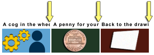
In Figure 2 the last portion of text is cut off in 3 side-by-side headings. The 1st heading should read "A cog in the wheel." But it reads "A cog in the whe". Only half of the second "e" is visible and the letter "l" is completely missing. The 2nd heading should read "A penny for your thoughts". But it reads "A penny for your". The 3rd should read "Back to the drawing board." But it reads "Back to the drawi".
Text Overlap
In Figure 3 the last 3 words "Groups and Programs" of the heading "Technologists Seeking Input from Groups and Programs" overlap the following sentence. That sentence should read, "You are invited to share ideas and areas of interest related to the integration of technology from a group or program perspective." But the words "You are invited to share ideas" are obscured and unreadable.

Benefits
- People with low vision who require increased space between lines, words, and letters are able to read text.
- People with dyslexia may increase space between lines, words, and letters to increase reading speed.
- Although not required by this SC, white space between blocks of text can help people with cognitive disabilities discern sections and call out boxes.
Examples
When spacing is being overridden to the SC's metrics:
- Text fits within the bounds of its containing box without being cut off.
- Text fits within the bounds of its containing box without overlapping other boxes.
Resources
Research
The grounds for this SC are based on research. The metrics chosen as measures are based on the McLeish study. She ran from .04 to .25 em tests. McLeish found an increasing curve in reading speed of actual materials up to .25, but it started to flatten at .20. Previous studies that reported no improvement started at .5em. Right at the flat point. Wayne E. Dick, Ph.D. analyzed the McLeish study and translated from points. Dr. Dick recommended the metrics that the Working Group adopted.
Languages and Scripts
Roughly 480 different languages and scripts have been tested. Maximum spacing adjustments allowed by the SC were set on the following 3 pages:
Results
No adverse effects occurred. The following are the specific findings:
- Character Spacing
- Individual characters in words remained intact though they were spaced a bit further apart.
- Word Spacing
- Words were spaced farther apart. In languages that do not have words (e.g. Japanese) applying word spacing had no effect. This is expected.
- Line Height
- Changing line height did not separate diacritics from characters, nor did it adversely impact ascenders or descenders.
As previously discussed, the ability to read text with adjusted spacing is a user responsibility. This is true no matter the language.
The SC's exception addresses cases where a text style property is not used in a language or script. In such cases, authors are only required to ensure relevant properties do not break the layout.
Other references
- Allan, Kirkpatrick, Lawton Henry, Editors. (2017). Accessibility Requirements for People with Low Vision (3.4 Spacing for Reading). World Wide Web Consortium.
- Stylus Team (2012). Stylus browser extension (Firefox, Chrome, and Opera) (compatible with Userstyles.org material).
- Campbell, Alastair. (2017). Text Adaptation Bookmarklet. GitHub.
- Chung, Susana T. L. (2012). Dependence of Reading Speed on Letter Spacing in Central Vision Loss. Optom Vis Sci.
- Chung, Susana T. L. (2002). The Effect of Letter Spacing on Reading Speed in Central and Peripheral Vision (PDF). IOVS ARVO Journals.
- Mcleish, Eve. (2007). A study of the effect of letter spacing on the reading speed of young readers with low vision (PDF). The British Journal of Visual Impairment 25.2: 133-43.
- Rello, L., & Baeza-Yates, R. A. (2017). How to present more readable text for people with dyslexia. Universal Access in the Information Society, 16(1), 29-49.
- Sjoblom, A.M., Eaton, E. and Stagg, S.D., (2016). The effects of letter spacing and coloured overlays on reading speed and accuracy in adult dyslexia. British Journal of Educational Psychology, 86(4), pp. 630-639).
- Zorzi, Marco et, al. (2012). Extra-large letter spacing improves reading in dyslexia. Proceedings of the National Academy of Sciences.